
Introduction
HaiSoTec Tickets and Vorgano have a new interface. Navigation sits at the side, lists and records get the full width, and colour is used where it carries meaning: for a ticket's status, for the priority and for an SLA deadline that is about to expire. Features, fields and permissions are retained. What is new is how quickly everyone gets where they want to go, and how much they see at a glance.
All areas in the sidebar
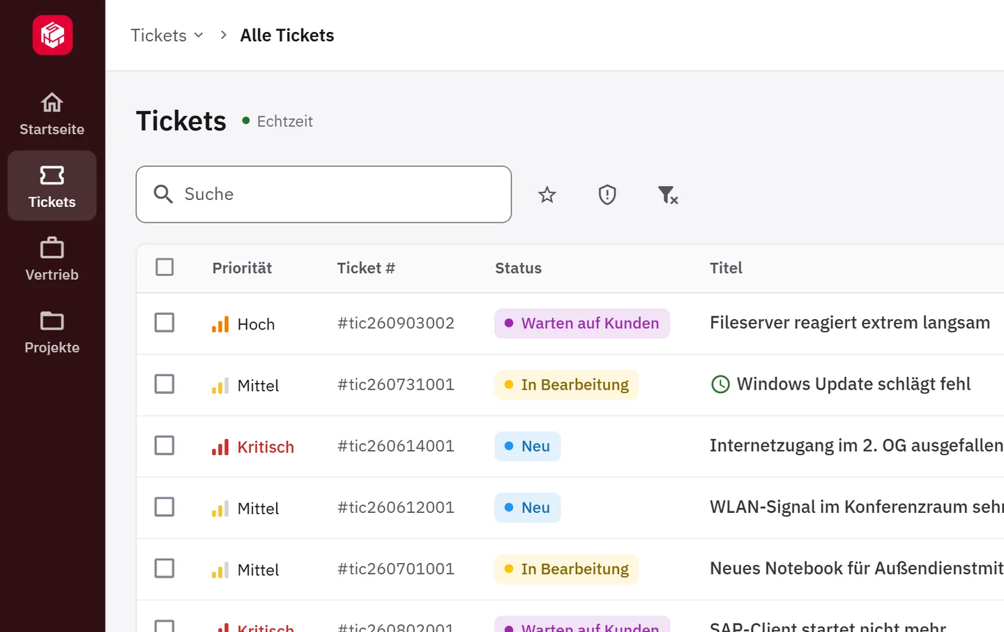
The sidebar shows all areas one below the other, such as Tickets, Projekte, Vertrieb and Lager (tickets, projects, sales and warehouse), depending on what a company uses. The area of the current page is expanded; the others open with a click.
On smaller screens, for example on a laptop, the sidebar stays narrow, with a short label under each icon, and expands fully with a click. On a wide monitor it is shown in full; in the administration area (Verwaltung) it stays narrow. The browser on that device remembers which layout someone prefers. The top of the sidebar shows your own company's logo and colour; the narrow sidebar shows the company's icon.
Straight there with Ctrl+K
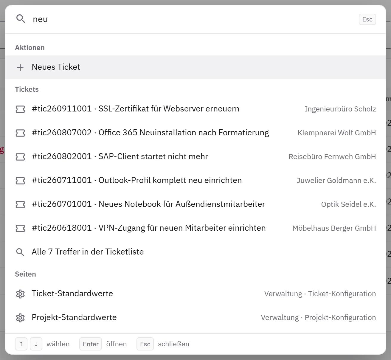
From any page, Ctrl+K (⌘K on a Mac) opens a search across pages and open tickets, plus “Neues Ticket” (new ticket). Type in a ticket number or keyword, select the result, press Enter — and the ticket is open. The search only shows what the individual user is allowed to open.
On a computer, the path to each page appears above it, and clicking an area in that path lists its pages. A back arrow in the header bar takes you to the previous page. So even after three clicks it is clear where you are.
More at a glance
Lists start higher up on the screen. In the ticket list, the search and the most important filters sit in one row, less frequently used ones behind “Filter anzeigen” (show filters), and the title gets the most width. In quotes and orders, the amounts are right-aligned in a column. Category, type and number appear as understated text; the status, the priority as a bar, and the deadlines carry colour. That way, what should stand out stands out immediately: an overdue ticket and, with SLA targets, a deadline that is about to expire.
While loading, the list already shows its shape. An empty list says that there is nothing there and, where appropriate, offers the next step.
Everything in view inside the ticket
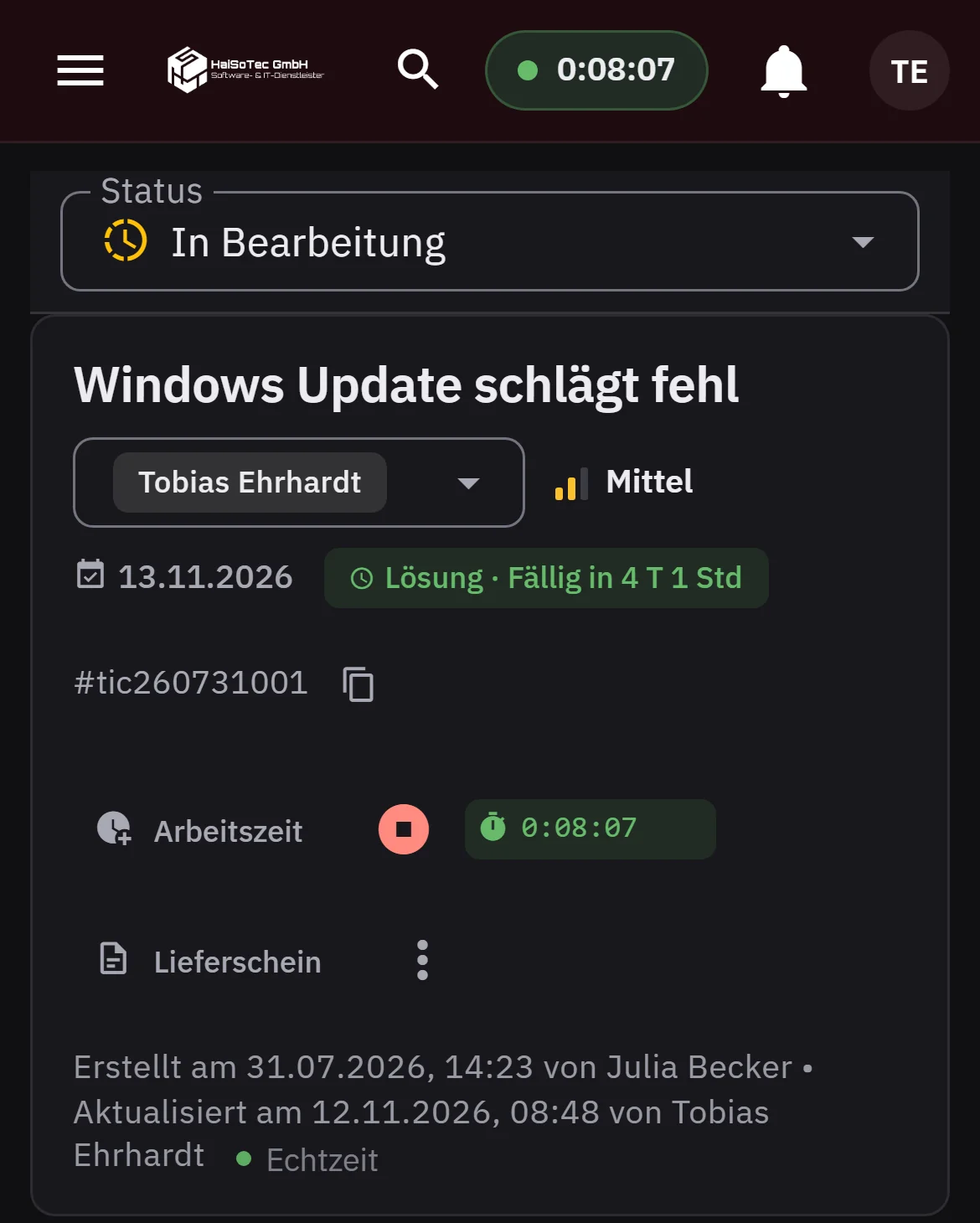
On a computer, the business partner, properties and working time appear on the right in the ticket — on every tab. The header shows the title, status, agent, priority and the ticket's actions. Anyone writing a comment or entering line items sees the status and agent in the header and the properties alongside on the right.
Projects follow the same layout, and in Vorgano so do quotes, orders and contracts: a header with status and actions, the business partner on the right. Anyone familiar with one of these records will find their way around all of them.
The business partner has a page of its own with contacts, tickets, projects, orders and contracts — and, for partners you maintain yourself, also addresses and history. The page has its own web address and can therefore be passed on to colleagues who are allowed to see business partners.
Easy to read, light or dark
A new typeface, calm surfaces and clear spacing make long lists easier to read. Status colours, including ones you define yourself, are toned so that the text on them stays clearly legible.
In the account menu you can choose light or dark, or “Automatisch” (automatic): the system then follows the computer's setting. On a phone, and on a tablet in portrait orientation, the sidebar slides in from the side when needed, and the top bar carries the company's colour.
A tidy administration area
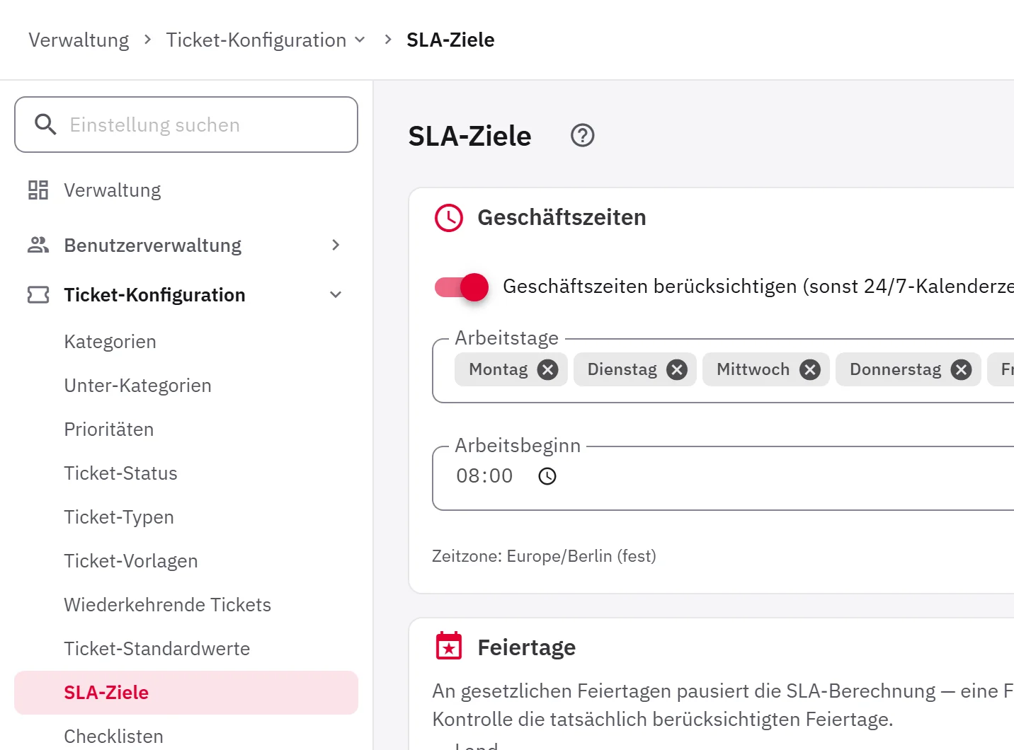
The pages in the administration area are named after their menu entry, such as “Prioritäten” (priorities) or “SLA-Ziele” (SLA targets). The explanatory notes are fully retained and open via a question mark. That way, the page starts right at the top. With “Einstellung suchen” (search settings), you can find a setting quickly without going through the sections.
The same work in a new design
The redesign concerns how the system looks — what it does stays the same. Every feature, every field and every permission is retained. The system now opens the business partner as a page of its own instead of a window. The employee portal, where it is set up, and the customer portal also show the new design.
A morning at the service desk
At eight o'clock, the dispatcher at an IT service provider opens the ticket list on her laptop. The sidebar is narrow, the list has room, and a ticket whose deadline has passed stands out immediately.
A customer calls and gives their ticket number: Ctrl+K, the full number, Enter, and the ticket is open. While she writes the comment, the status at the top and the due date on the right stay in view.
Then the customer asks about their maintenance contract. A click on the business partner opens its page, the “Verträge” (contracts) tab lists all contracts, and she sends the link to her colleague in sales.
Availability
The new interface is available now in HaiSoTec Tickets and Vorgano and is switched on system by system. New systems and new test tenants start with it. There is nothing to install: once it is switched on, the new interface appears the next time the system is opened. The images on the two product pages also show what it looks like.
Tickets and Vorgano on your phone: the mobile version is here — capture signatures, photos and working time directly at the customer's site
The employee portal: report issues instead of writing e-mails — a lean interface for everyone in the company
From quote to invoice: the document flow in HaiSoTec Vorgano — enter the customer and line items once, with the e-invoice at the end
Try it out
Get no-obligation advice — free intro call (~30 minutes); reply within one working day
Request a test tenant — usually provided within 48 hours of the intro call
Contact us directly: vertrieb@haisotec.de or +49 7474 3199681